We had already ediited the photogrpah on Adobe Photoshop so this gave us a head start since we used the same photograph for the CD cover.
Firstly we adjusted and edited the phtograph on Adobe Photshop and expaned the size of the phtograph so that it would be suitabel for the poster.
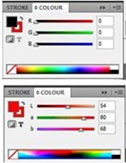
We then impotrted the phtograph into Adbobe Indesign gradually started to add text to the picture by selecting which font we wanted and choosing which colour would be suitable according to our research.
We copied and paste the Cd front cover from a speprate document and added a red outline around it so that it would relaet to our colour scheme. After placing the picture of the front cover of the CD case onto the poster, we decided as a group that this would be our final poster. However after receiving negative feedback, we decided to edit the poster further.
We therefore decided to add more infoamtion ontot our poster in order to make the porodcut look more professional and realistic by selecting the fonts and colours needed as before.
Final poster below.

 Above is a diagram that relates our Final magazine design with our research.

