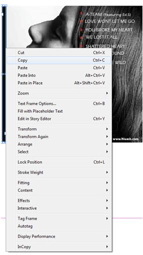
Firstly we clicked on 'type' then 'font' and then selected the font we used for the front of our CD case which was called 'Eras light' when using Adobe Indesign.
After placing all the text onto the picture, this was the outcome. We decided to put the number in red font as continuity from the front cover of our CD case as well as the rest of the text as white synergsising the products together due to the red and white colour scheme.
Then, by using a line tool we added side lines onto each side of the picture for the sides of the CD digi-pack.

We then decided to add a bar code to our picture to make it look more professional and so we imported it onto the picture and decreased the size of it, placing it in the bottom left hand corner.
This is the final edit
Here is an attempt of us drawing out a signature to add to the picture, however once made we felt that the signature was not appropriate and looked very messy and unprofessional.


No comments:
Post a Comment